Overview
Why would you use the new VerticalScrollArrangement Component when there is already a Scrollable property available for each Screen? Let’s take a look at each option and discover the difference.
The Scrollable Property
The Scrollable property for Screen1 (or any screen) can be found in the Properties panel near the bottom. It is activated by clicking the check box.
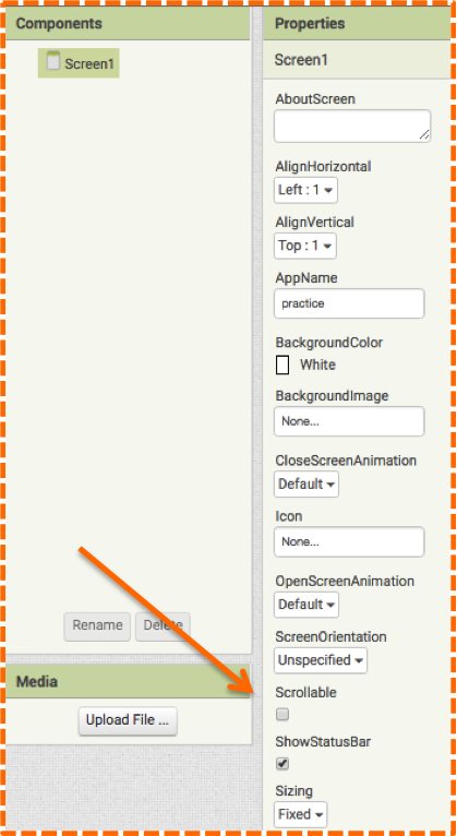
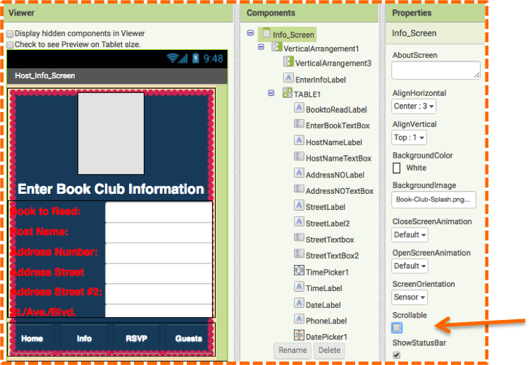
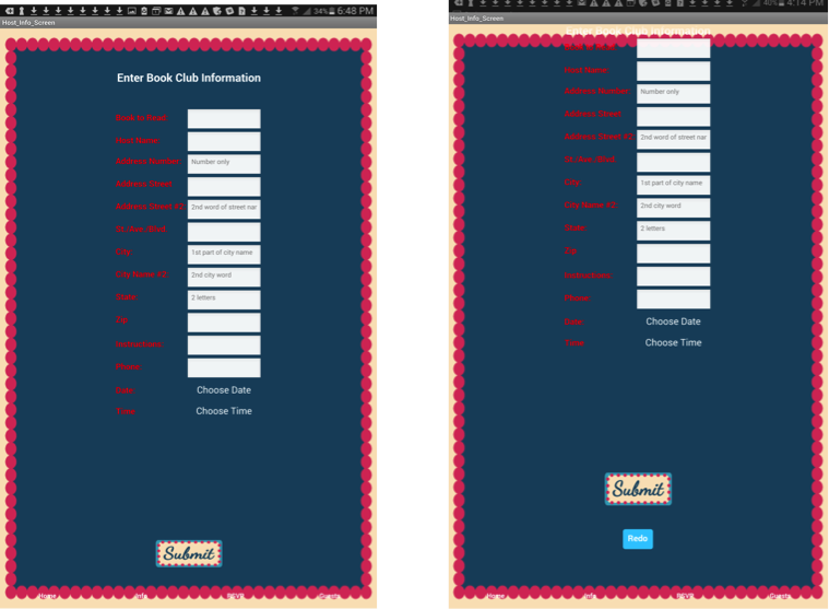
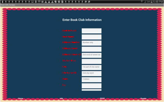
At first glance, you may think that this property must be helpful for the app user. But soon you will see, it is actually a necessity for the app developer! When building any UI, you only have the small Viewer window in which to work. But, the Viewer is actually much bigger than what meets the eye. To gain the full scope of the Viewer and ultimately your UI, you will most definitely want to enable the Scrollable property for whatever Screen you happen to be working on. You may not find the need for it when you just begin building your UI, but if you have a lot of information to display, you will soon discover that you run out of space. If you don’t have the Scrollable property enabled for your Screen and you add Components to the Viewer, you will see them listed in the Components panel, but you won’t be able to access them as they are sitting outside of the Viewer window. Thus, there is no way to click on them and manipulate them. As shown in our Book Club App in Image #2, the Viewer only shows the form up to the Street Address, the developer cannot access the rest of the Components that fall underneath.
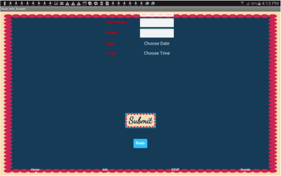
But if you check the Screen’s Scrollable property to active it, a grey scrolling bar will appear in the Viewer as shown in image #3.
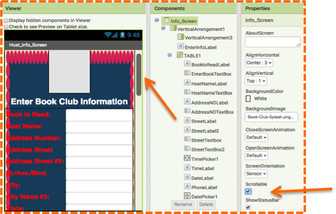
With the Scrollable property checked, you will easily be able to scroll down to view and edit the complete UI.
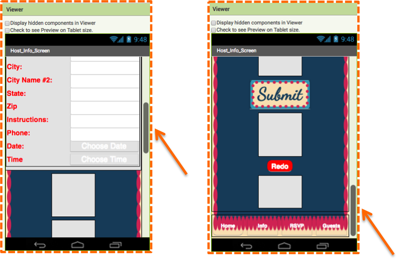
When developing apps, you will most likely always enable the Scrollable property to aid you in your app design. Similarly, if you need the Scrollable option as an app developer, your users will also need this feature to navigate the UI on their mobile device. For the user, they can swipe up so that the whole screen scrolls and the full UI becomes visible. Images #6 and #7 show the mobile device before and after scrolling in Portrait Mode.
Images #8 and #9 show the mobile device before and after scrolling in Landscape Mode.
Now let’s check out the competition and see why a developer may choose an option other than the Scrollable property when creating a UI.
The VerticalScrollArrangement Component
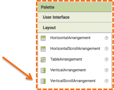
The VerticalScrollArrangement Component can be found at the bottom of the Layout Palette in the Designer.
By using VerticalScrollArrangement you can have more control over your UI than with the Screen Scrollable property. With the Scrollable feature, the whole UI scrolls, which may be useful for many app designs. But, with VerticalScrollArrangement you can create scrolling for just certain parts of your UI. You may find this useful if say you have a list of items on the left side of your UI and a longer list of items on the right side. Using VerticalScrollArrangement on the right allows the left list to be untouched, while the right list scrolls. As another example, we will show 2 columns of book choices in our Book Club app. By using the VerticalScrollArrangment for each column, the user can scroll each column independently instead of scrolling the entire UI.
To build a list of books that the app user can choose from, we first started building our UI by adding a VerticalArrangment onto the Viewer as a spacer to move our entire UI farther down on the screen. Next, we added a HorizontalArrangement and then nestled 2 VerticalScrollArrangements into it side by side. Into each VerticalScrollArrangement, we added a TableArrangement with the settings 2 columns and 20 rows. Then into each TableArrangement we added 20 Labels and 20 Buttons. Image #10 shows the Components panel with TableArrangement collapsed and Image #11 shows the TableArrangement expanded to reveal the many Buttons.
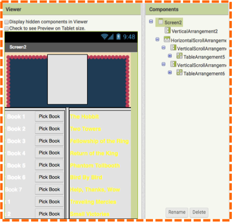
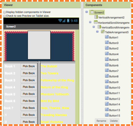
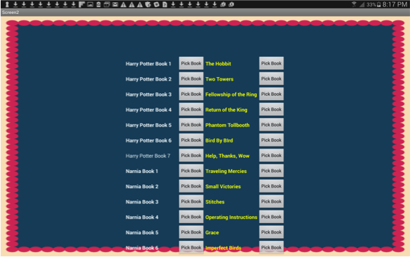
Image #12 shows the view on a mobile device.
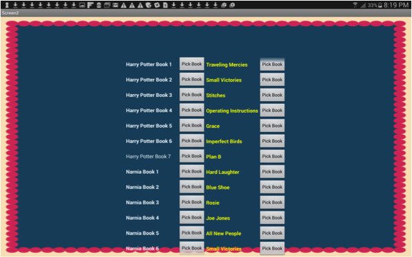
By using the VerticalScrollArrangment, the user can scroll through one column at a time without moving the rest of the UI, which in this case is the other column. Image #13 shows a snapshot of a user having scrolled through column 2 while leaving the first column intact.
You can see from our examples that both scrolling options will come in handy when creating apps. The Scrollable property will always help provide an extended view of the UI for both the developer and user, while the VerticalScrollArrangement Component provides the developer and user with a more specific and independent scrolling tool.
An interesting note: if you enable Scrollable property and use the VerticalScrollArrangement Component, App Inventor will default to the Scrollable property full-screen scroll. So, if you are creating a specific design with VerticalScrollArrangement that you want to feature prominently in your app, you will want to enable the Scrolling property when developing your app and then disable it when publishing your app.