This module builds upon two other tutorials. One blog post called: All About Buttons, provides Button basics and can be found here. The other UI module called: Labels, Textboxes, Layouts and Colors introduced various components to a simple form along with the new make color block. To get up to speed, it is recommended that you review it here before continuing.
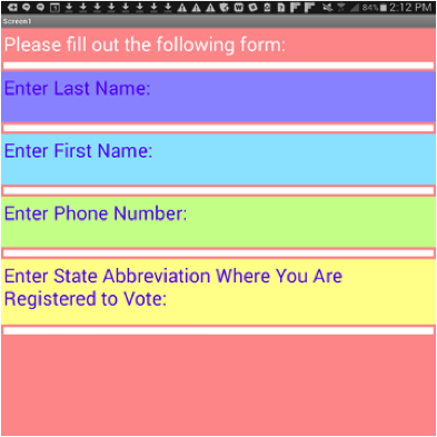
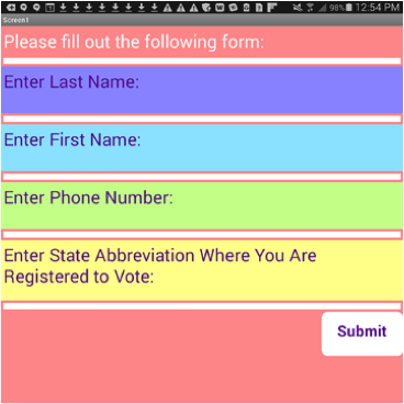
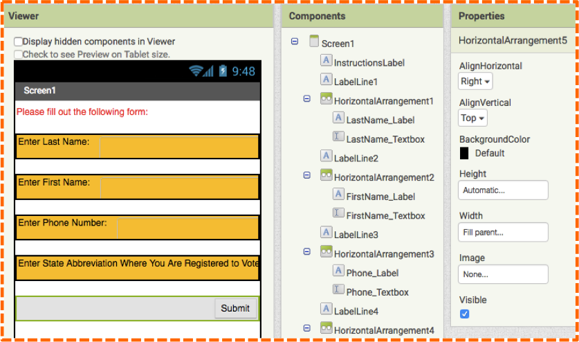
Previously, we created a simple form shown in the image below. You will notice that the form has no submit button, which renders the form rather meaningless. In this module, we add a submit button to the bottom right of our form and reveal more about buttons along the way.
Step 2
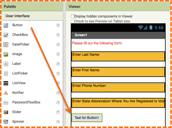
Click and drag the Button Component to the Viewer underneath HorizontalArrangement4. Rename it Submit_Button. Notice how its sits on the left hand side of the Viewer as shown in the image below.
Step 3
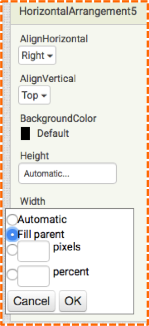
Drag a HorizontalArrangement onto the Viewer underneath the Submit_Button. Since you just added it to the Viewer, the HorizontalArrangement is currently selected. Change the Width property to by clicking on the word “Automatic” and choosing the radio button next to “Fill parent” as shown in the next image. Click OK.
Step 4
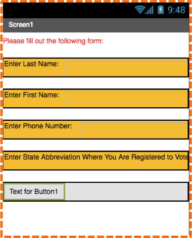
Drag the Submit_Button into the HorizontalArrangement5. Notice how the HorizontalArrangement shrinks to the height of the button. Also notice how the Submit_Button still sits on the left hand side of the screen, as shown in the image. We will fix this alignment next.
Step 5
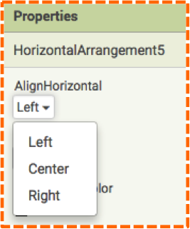
To change the alignment of the Button, select HorizontalArrangement5 either in the Viewer or in the Components panel and go to the Properties panel. The first property at the top is AlignHorizontal, click on word “left” and select “right” from the pop-up menu.
Step 6
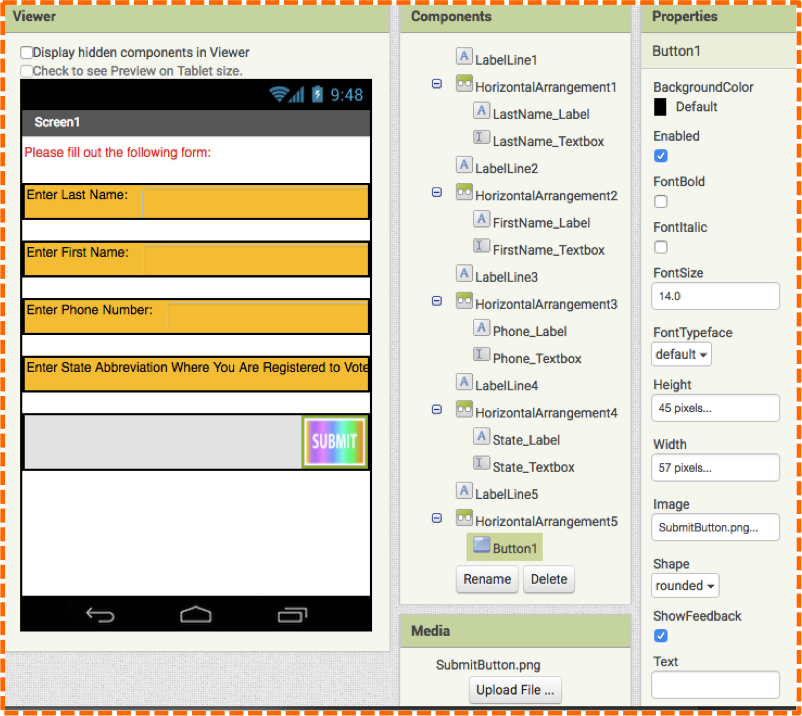
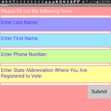
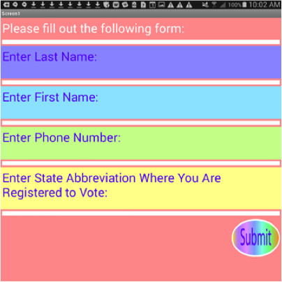
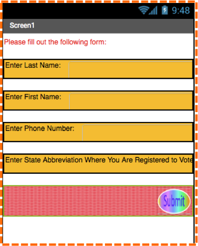
Click on the Submit_Button in the Viewer or the Components Panel and change its Text property to “Submit”. Your computer screen should resemble the image below.
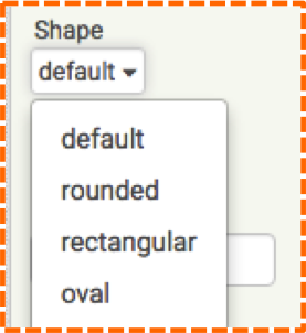
You can easily change the Button shape in the Properties panel as shown in the images below.
RGB
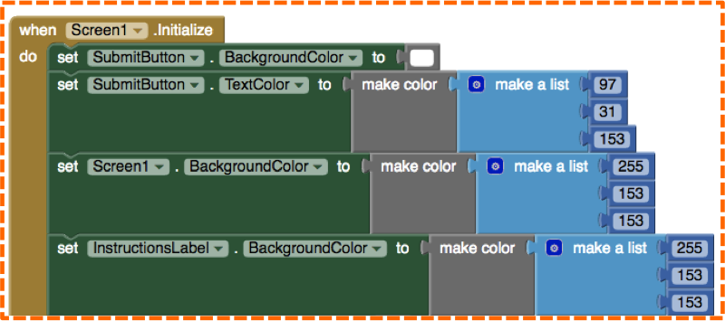
Now that you know how to create your own color in the Blocks editor with the make color block, you can use RGB values previously used in the form for the button.
- Add set SubmitButton.BackgroundColor and set SubmitButton.TextColor blocks along with the make color blocks as shown.
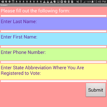
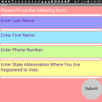
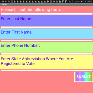
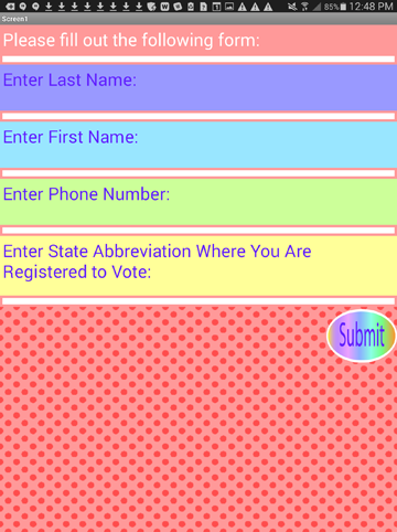
Your mobile device will be similar to the image below.
UI Skills
If you’d like to expand your UI skills to the next level and add designs of your own, you can create images for buttons (or backgrounds) with free software like https://pixlr.com/ and https://www.gimp.org/ or with paid software like Adobe Illustrator or Adobe Photoshop. Creating a button of your own design may take a little time and practice, but with the help of online tutorials, you will get the hang of it in no time!
We created a button image using the free site, pixlr.com. Since we read a MIT Touch Lab study that found the average width of most adult index fingers to be 1.6-2cm or 57 x 45 pixels, we chose to use this measurement for both our image and button size. Once we created our design and saved it to our computer, we then uploaded our image onto the Submit_Button for a one of a kind design.
You can create Buttons any size you like. For example, you could set the Height and Width properties for the Submit_Button to be Automatic, and create a large button image (800 x 600 pixels) in Pixlr. When you upload the image, the Button set at “Automatic” will automatically re-size the image to fit. But, if you do decide to set your Button size to specific pixel dimensions, it is recommended to also choose the same pixel size for your Button image.
Let’s learn the steps.
- Choose a Button size by either setting the Height and Width properties to “Automatic” or a pixel size of your choosing.
- Create a button image in an external software program, save it to a folder where it can easily be retrieved.
- Upload the image one of two ways. Either with the Media tool found below the Components panel or with the Image property for the Submit_Button in the Properties panel.
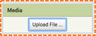
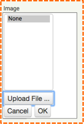
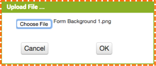
Either method will launch a pop-up allowing you to “Choose File.”
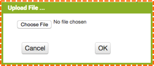
Once you have located and chosen the file from your computer, click OK.
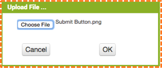
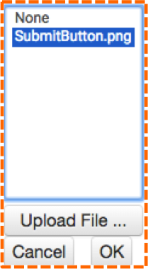
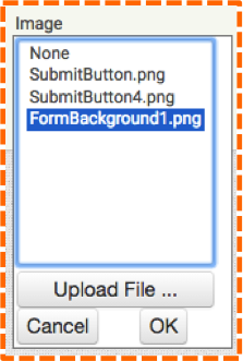
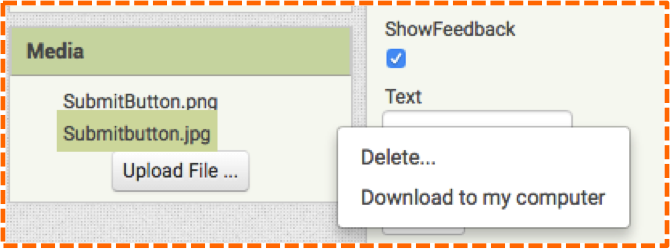
Now, your image will appear in both the Media panel and as an option under the Image property in the Submit_Button Properties panel. (Note: we named our image Submit Button.png with a space between Submit and Button, but when we uploaded it, App Inventor eliminated the space, as shown above and below.
The image below shows our button image in the Viewer, in the Media panel, and in the Image property in the Properties panel.
You can play with image shapes, sizes and text to find one that you prefer. The following images show various shapes that we created.
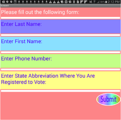
We’re sure you guessed that if we can add an image to a button background, we can add images to other backgrounds. We decided to create a polka-dot design in Adobe Illustrator and upload it to HorizontalArrangement5. Here are the steps.
The image name displays in the Media panel and in any Image property. We chose the Image property for HorizontalArrangement5, as shown in the image below.
Our uploaded image displays in the Viewer in the Designer as in the first image below and our mobile device displays as in the second image below.
The more well-versed you become using image manipulation software, the more creative your UI designs will become. You can upload an array of designs to various backgrounds to see what works well and what doesn’t.
In case you want to delete an image that you uploaded, simply click on the image name in the Media Panel and a pop-up window will appear as in the image below. Click delete. Note: while you can upload images in both the Media panel and Image property in the Properties panel, you can only delete images from the Media panel.
Anytime you encounter a background in App Inventor, you have the option to upload an image. Thus, you can create custom designs for Screens, Labels or Layouts or you can simply add an image anywhere in your app with the Image component. With the make color block and the option to upload custom images created in another software program, you can make endless unique UI designs.