While creating attractive user interfaces is easy with App Inventor, it may not be obvious. In this module you will learn how to make use of Layouts, Labels and Textboxes while creating all sorts of new colors. Yes, it is possible!
Labels are similar to Buttons in that they are found in the User Interface Palette in the Designer, but are different in that they are not clickable. Anytime you want to include text in the UI of your app, you can use a label. Labels can display things like: instructions, a title or a list. For example in a game app, a user will want to see things like the score, the level, the time remaining, etc. All of these can be easily displayed using a label.
Textboxes are also found in the User Interface Palette. They are used when a developer wants an app user to input information, like a name or date. Layouts help to format components so they are attractive and organized on the screen. The example in this module will use the HorizontalArrangement.
Creating attractive User Interfaces in App Inventor tends to frustrate people mostly because of what I like to call, the Color Controversy. New developers see the limited saturated hue options in the Designer and go nuts. How is it possible to create nice looking layouts if there are only 8 saturated colors, a few greys, black and white??? Its not. We completely agree. But those are hardly the only color options. One just must know where to look…
To practice using Layouts, Labels and Textboxes and to dispel the limited color option myth (and end the fuss once and for all), we will create a simple form.
Designing a Form
- Sign into App Inventor Create a new Project and name it: Form.
- Connect your mobile device so that you can view changes as they occur.
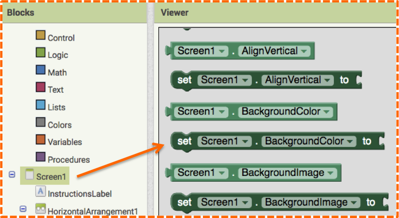
- Click on the Label in the User Interface Palette (image #1) and drag it to the Viewer (image #2).
When the Label is active (highlighted in green in the Viewer), its properties display in the Properties panel on the right of the Designer screen. Changing the properties of any component reformats it to your liking.
- To change the text displayed on the Label, enter new text in the Text Property at the bottom of the screen (images #3 & #4). In this example type: “Please fill out the following form” and then click enter on your keyboard.
Changes you make in the text box will be reflected in the Viewer and on your connected mobile device.
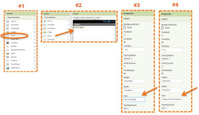
Note: changing the display text is different than changing the label name.
Re-Naming Labels
Whenever you create a new label in the Designer, it will automatically be named Label1, Label2, Label3, etc. Because it will be difficult to remember which label displays which information when you begin coding, it is good practice to rename labels to clearly describe their function.
The recommended standard is to use a capitalized descriptive name, followed by the capitalized component name - with no spaces between words. Examples include: “ScoreLable”, “TitleLabel” or “InstructionslLabel”. (AppInventor doesn’t allow spaces so if you accidentally type the name “Score Label” with a space in between the words, App Inventor will automatically insert an underscore and name your label “Score_Label”.) If you prefer, you can also purposely enter an underscore in a name: TitleName_Label.
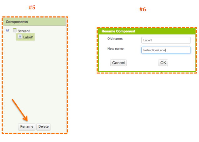
- To rename a label, activate it by clicking on it in the Viewer or in the Components Panel (it will highlight with a light green box around the name). Then click the “Rename” button at the bottom of the Components Panel (image #5). A pop-up window will appear, insert the new name into the text box, in this case InstructionsLabel, and click “OK” (Image #6).
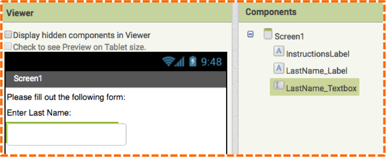
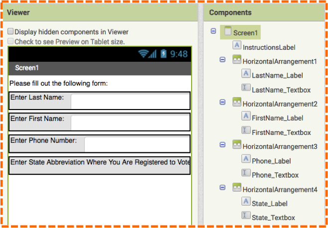
- Add another label below the InstructionsLabel, change the text to “Enter Last Name:” and change the Label name to “LastName_Label” (image #7).
- Click on a Textbox in the User Interface Palette, drag it to the Viewer below the LastName_Label and change the Textbox name to “LastName_Textbox” (image #7).
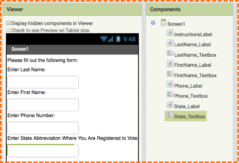
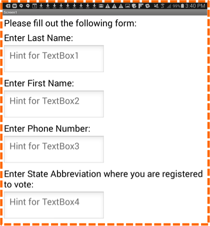
- Add 3 more Labels and Textboxes with the text and names indicated in image #8.
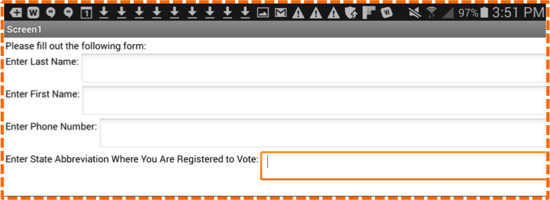
- This same view on a mobile device looks a little different (image #9):
Textbox Hints
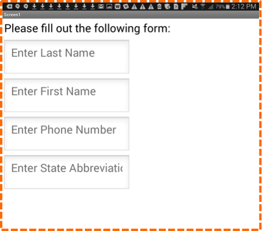
Notice on your mobile device that the Textboxes have light grey text inside them. One of the properties of Textboxes is “Hint.” The Hint Property gives you the flexibility to provide instructions inside the Textbox instead of on a Label. For example, we could have eliminated the Labels altogether and instead, typed the Hints: “Enter Last Name”, “Enter First Name”, “Enter Phone Number” and “Enter State Abbreviation Where You Are Registered to Vote” as shown in the following image (#10).
In this tutorial we decided to use Labels to display text instead of Hints, so we merely deleted the text in the Hint Property for all of the Textboxes.
Also note in image #10 that the line of text in the last Hint is cut off. This can be easily fixed by adjusting the width of the Textbox in the Properties Panel. We will do this in the next section.
Using Layouts
So far our form is very basic and uninteresting. We can use the Layout Component to make it more streamlined.
- Go to the Layout Palette and click and drag HorizontalArrangement to the Viewer, position it below the Instruction_Label and above the LastName_Label. Since we just placed the HorizontalArrangement into the Viewer, it is currently selected and its properties are displayed in the Properties Panel on the far right of the Designer window. In the Properties Panel, click on the white textbox below the Width property, it currently says “Automatic.” A pop-up option will appear, click on the radio button next to “Fill Parent” and click OK (image #11).
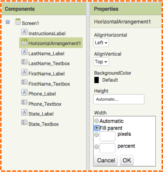
Now the HorizontalArrangement will fill the width of the screen.
- Click on the LastName_Label in the Viewer and drag it into the HorizontalArrangement. You will see the layout shrink to fit the height of the Label- this is because the layout height property is set to Automatic.
- Drag the LastName_Textbox into the HorizontalArrangement so it falls to the right of the LastName_Label. Your screen should look like the following image (#12).
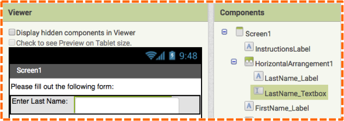
Take a look at the Components Panel. Notice how LastName_Label and LastName_Textbox are indented or nested inside of HorizontalArrangement1. This is another way to double check that indeed those components are inside of the HorizontalArrangement layout.
Next we will make some minor adjustments to the Textboxes to ensure ensure that no text will get cut off inside of the LastName_Textbox.
- Click on this component and repeat the step under the Width property. Click on the word “Automatic” and select the radio button next to “Fill Parent”. Click Ok. You will see the LastName_Textbox extend to the full width of the screen. Under the property, Background Color, click on the “None” option from the drop-down menu.
- Add 3 more HorizontalArrangements and repeat the steps so that the labels and their related textboxes are housed within their own layouts.
(You may find it difficult to position the State_Label and State_Textbox because the text on the Label is so long. Try positioning the State_Textbox into the HorizontalArrangement first and then adding the State_Label to the left of the Textbox.) Your Designer screen should look similar to image #13. Notice how the Labels and Textboxes are nested in the Components Panel. (Also note that 3 of the textboxes are white, this is simply to show the layout of the textbox, you will have chosen “None” for the Textbox Background Color, so your image will not show the outline of the Textboxes.)
Your mobile device will resemble the following image (#14).
To make the Layouts more obvious on screen, we will add a background color to each. Don’t worry about the limited color options in the Designer, we dispel the Color Controversy later in the Blocks Editor.
- Click on each HorizontalArrangement in the Components Panel and select Orange under Background Color in the Properties Panel.
Labels as Spacers
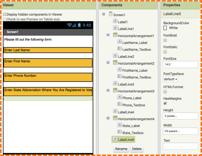
To make our form more visually appealing, we will create some space between the lines of text by using Labels as spacers.
- Click and drag out 5 Labels, one Label above each HorizontalArrangement and one underneath the last line of text. We will format them all the same. Click on the first Label and change the name to LabelLine1. Change the Background Color to White, the Height Property to 5 pixels, and the Width Property to “Fill Parent”. Delete the text in the Text Property. Repeat the same steps for the rest of the labels naming them LabelLine2, LabelLine3, etc. Your Designer screen should resemble image #15.
The time has come to play with color! You will soon discover that whatever color choices you make in the Designer can be easily overridden by the infinite possibilities the Blocks Editor (and Internet) has to offer. Say goodbye to boring UI!
Playing with Color
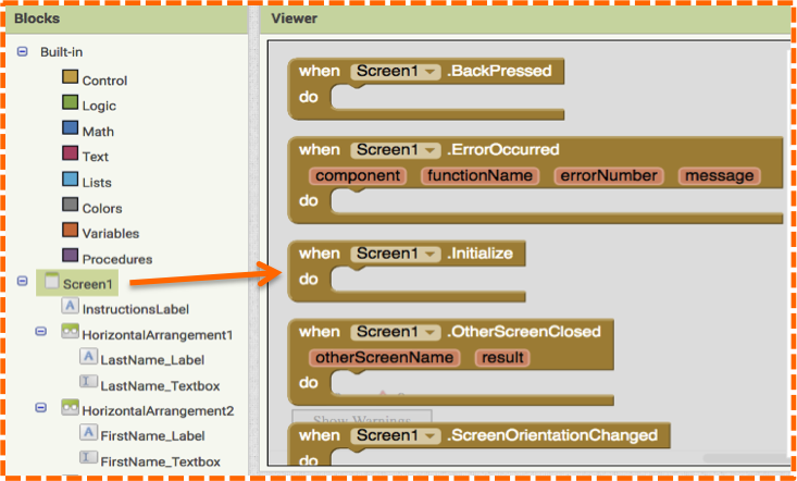
Head over to the Blocks Editor.
- Click on the Screen1 option in the Blocks Palette to view and select the gold when Screen1.Initialize do block as shown in image #16. It will appear in the Viewer.
The first color change we will make is to the Screen1 Background Color.
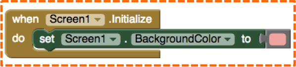
- Click on Screen1 in the Blocks Palette and scroll down to the green set Screen1.BackgroundColor block as shown in image #17.
- Insert the green set block into the gold initialize block. Next we will select a color.
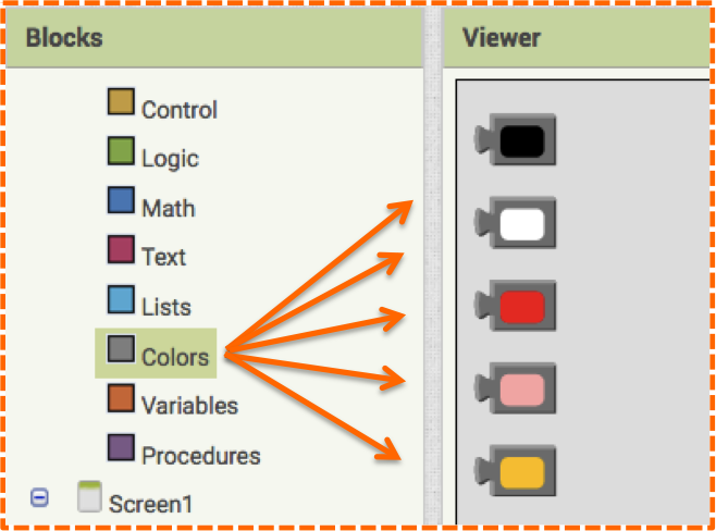
- In the Blocks Palette, click on Colors and select any color block as shown in image #18.
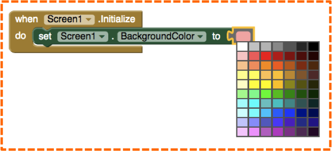
- Attach a color block to the green set block as shown in image #19.
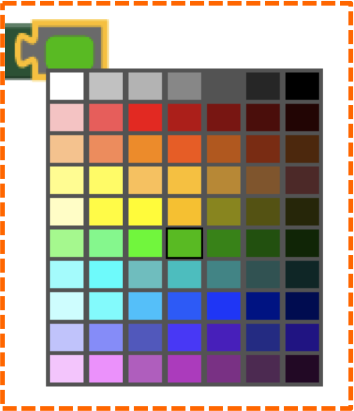
- To change the color, click on the color block to reveal a hue of colors, as shown in image #20.
- Select a color from the grid and notice that your color choice is indicated by a fine black line around the color square as shown in image #21.
Since we are using the when Screen1.initialize do block, changes will only reflect on your mobile device once you reconnect with AI Companion app or when you make a change in the Designer. Instead of reconnecting your mobile device each time you make a change in the Blocks Editor, simply toggle your screen to the Designer and make a small change, like clicking the checkbox next to FontBold or FontItalic in the Properties panel for a Labels. This tactic updates the app so you can view the updated Screen1 Background Color on your mobile device.
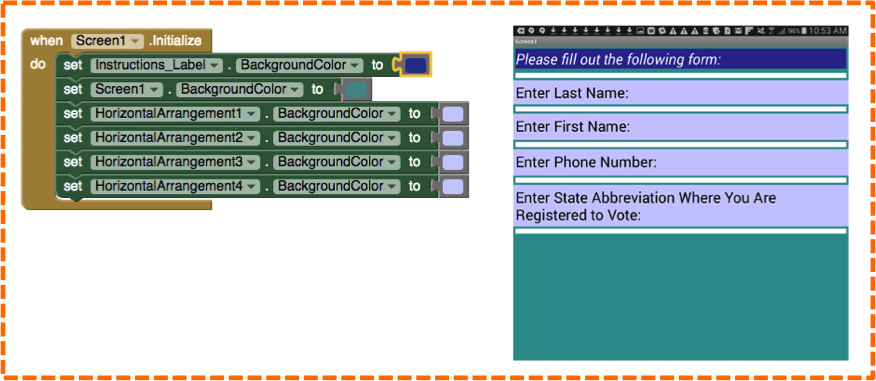
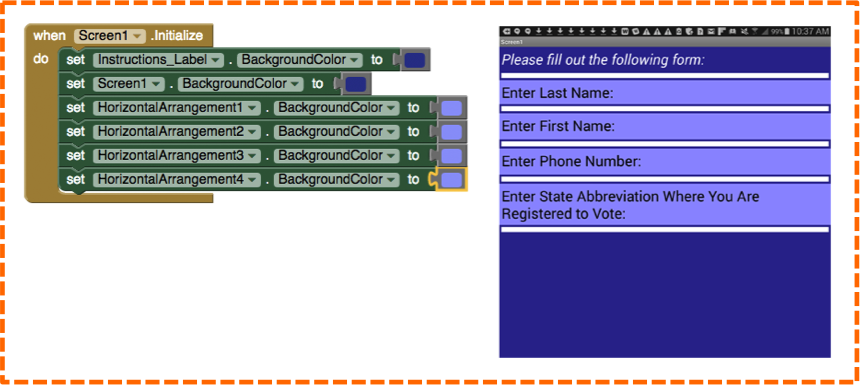
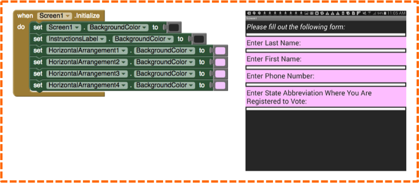
- Add Background Color set blocks for Instructions_Label and all of the HorizontalArrangements.
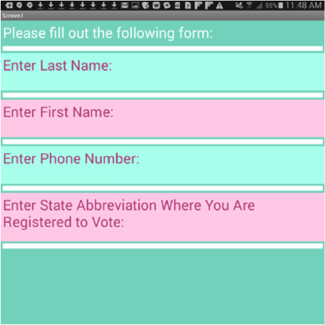
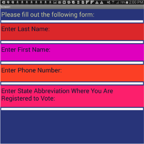
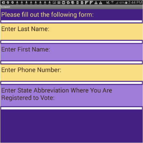
Doing so will enable you to try many different color schemes. Some examples are shown in images #22, #23 and #24.
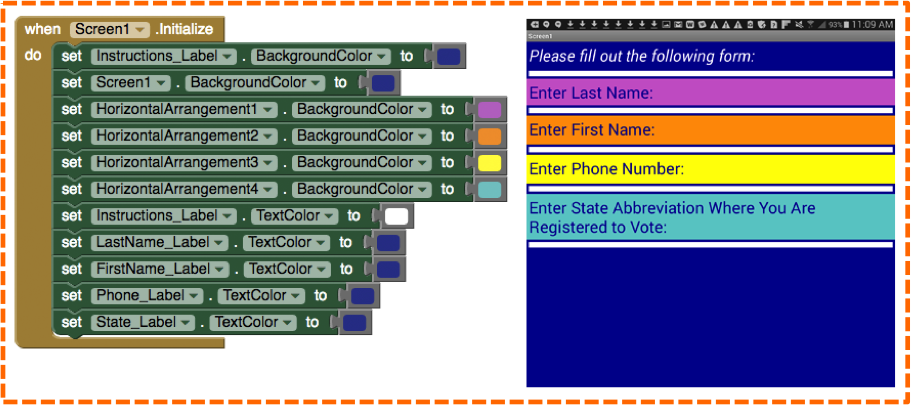
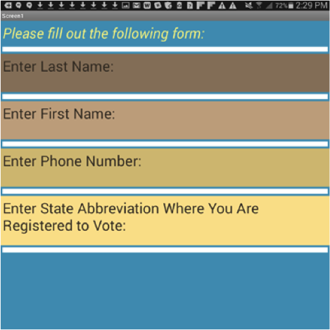
Explore further by adding new colors and set blocks to change the TextColor of the Labels as shown in image #25.
Creating Colors
You can utilize the color hues that App Inventor offers to make combinations, or wait for it, wait for it… you can make your own color! This means that any color you can possibly want, you can use in App Inventor. And you can use the Internet help you find colors that work well together to design exceptionally beautiful user interfaces.
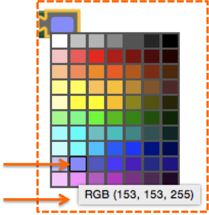
Hovering over a color in the App Inventor palette reveals its RGB values as shown in image #26. The RGB (R=Red, G=Green, B=Blue) system uses values 0 – 255 to represent the intensity of each color. This allows for an enormous amount of colors to pick from, 256 x 256 x 256 = over 16 million possibilities! But how do you do this if App Inventor only offers a 7 x 10 grid? We will tell you in a sec. But first, let’s go to the web.
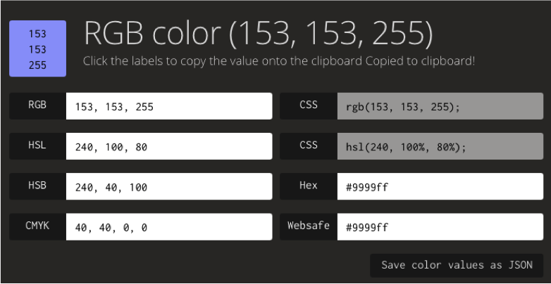
Knowing a color’s RGB values can assist you in finding out the hex number (a 6 digit number used in HTML and CSS to represent Red, Green and Blue), the Pantone equivalents and complimentary colors to easily expand your UI. Simply plug your RGB values into a free website such as RGBto and discover an array options as shown in images #27 and #28. (In this example we use the RGB color 153, 153, 255 from the App Inventor grid.)
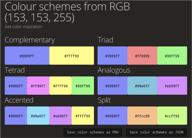
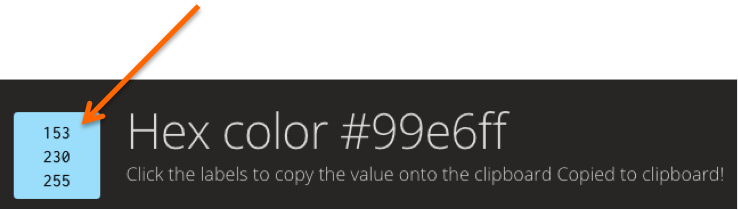
With sites like rgb.to, you can discover an assortment of complimentary hues to go with any color you pick. The colors display Hex numbers (indicated with the hashtag) and clicking on any of the suggested colors (say #99e6ff for the blue hue) will reveal this color’s RGB values as shown in image #29.
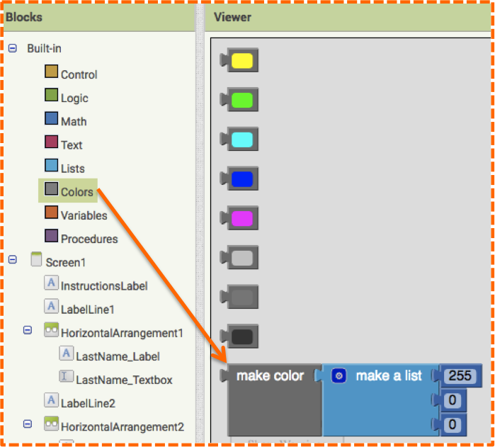
Then… ta da… you can add this value into App Inventor with the make color block found at the bottom of the Color blocks as shown in image #30.
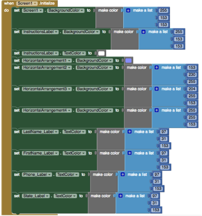
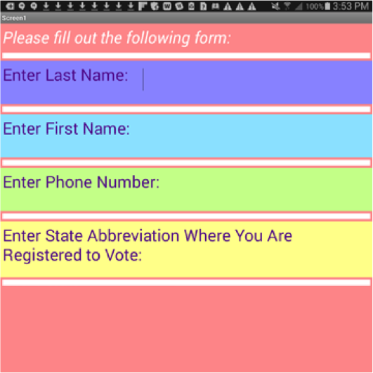
Yes indeed, this means that you can create your own color and color combos in App Inventor, the possibilities of are pretty much endless (#31-#36).
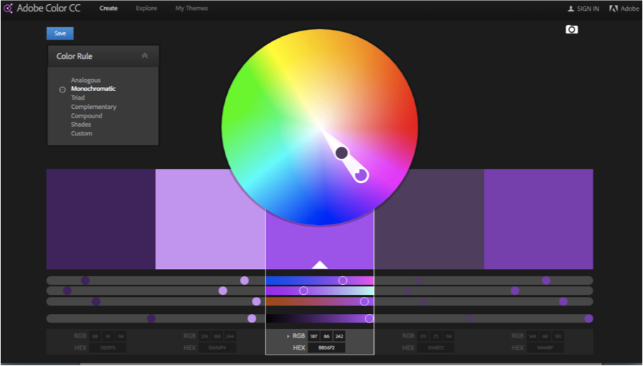
Another awesome free web resource is the Adobe Color wheel (also known as Adobe Kueler): https://color.adobe.com/create/color-wheel/. Here you don’t need to know the RGB values ahead of time, you can just pick colors whimsically from the wheel (image #37) to discover color combinations or you can select from a pre-defined color scheme palettes (image #38). Both options give you the associated RGB values and Hex number.
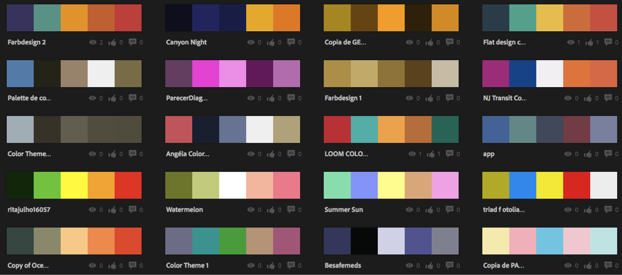
(The endless color schemes appear on the Explore page. Hover over a color scheme to reveal a pop-up menu, click “edit copy” to be taken to the color wheel for that combination of colors as shown in image #39.)
As you can see designing the UI for a simple form in App Inventor is a creative process with an array of unexpected possibilities. In future modules we will explore the use of other layout components: VerticalArrangement and TableArrangement.