TableArrangement
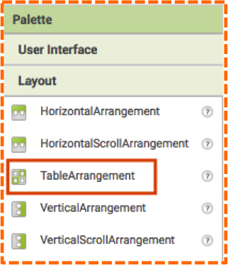
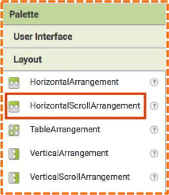
TableArrangement is handy option in App Inventor for organizing the UI of your mobile apps into a neat and tidy grid. You’ll find Table Arrangement in the Layout Palette, as shown image #1.
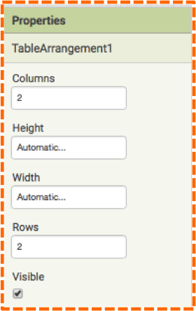
The default properties for TableArrangement include 2 columns, 2 rows as shown in Image #2.
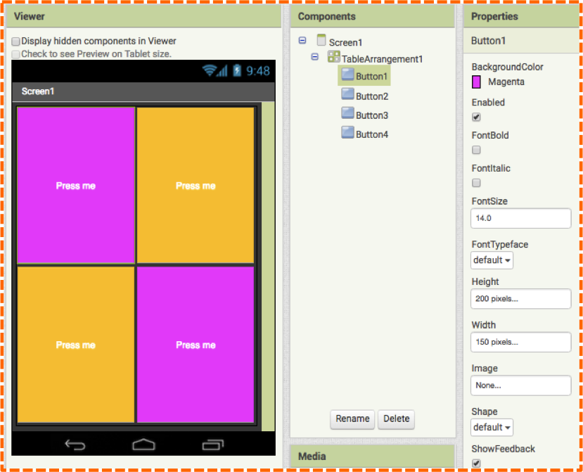
Using these default settings you can easily add 4 Buttons and set the color and text properties to create something that appears in Image #3.
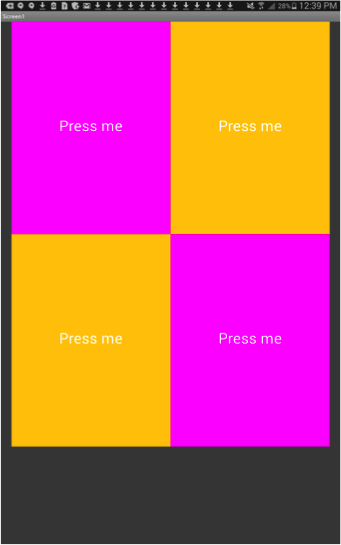
This layout on a mobile device appears as in Image #4.
By changing the number of columns and rows in the Properties panel, you can make any kind of grid to display information.
In this next example (Image #5), we nestled 5 TableArrangements inside of 5 HorizontalArrangements to display stock information. Each TableArrangements has with 2 columns and 3 rows to display 3 labels and 3 pieces of information. The left column displays the text label, the right column displays the changing stock information and the 3 rows display the Price, Change and High information respectively.
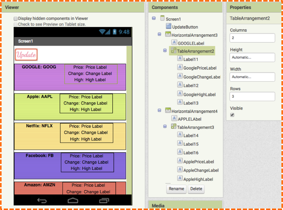
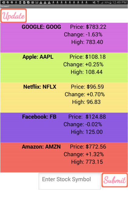
Image #6 shows the stock app view on a mobile device.
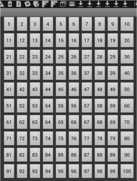
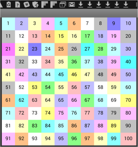
In the next example, we used the TableArrangement Component to create a 10 x 10 grid to display 100 buttons, as shown in image #7.
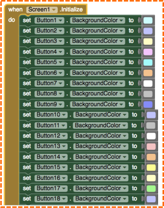
In the Blocks Editor, by using the Screen Initialize block and Set Button Background Color blocks, you can change the color of the Buttons, some of which are shown in image #8.
Compare Image #7 to Image #9. Notice how the Set Button Background Color blocks changed the shape of the buttons in the mobile device view - there is now no longer space between buttons.
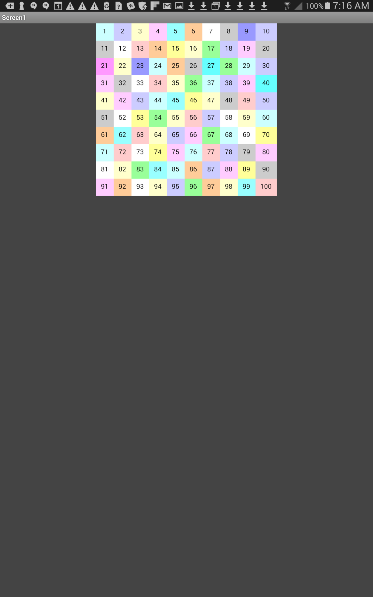
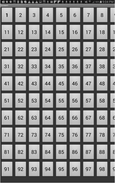
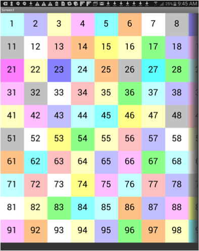
Note: this mobile device view in Image #9, where all of the columns are visible clearly showing all 100 Buttons, is achieved by setting the Screen1 Sizing Property to: Responsive. But these settings don’t necessarily present a viable option for app users because in reality the mobile device view resembles Image #10.
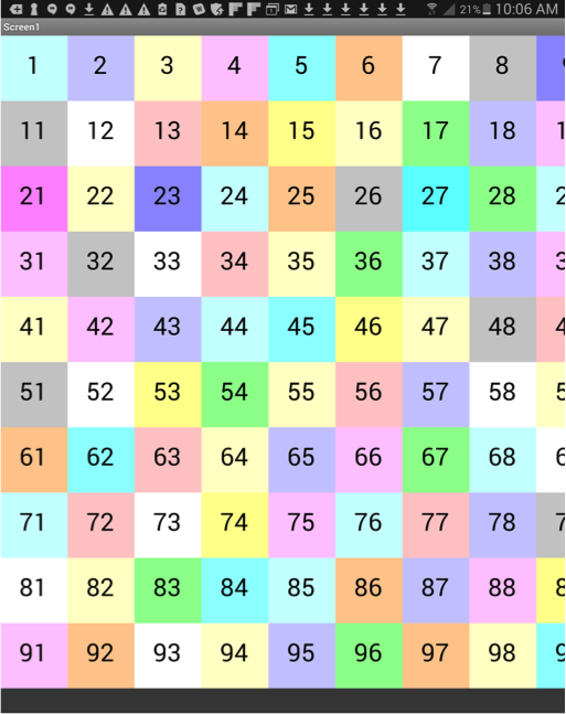
Clearly, the UI appears too small on the mobile device for users to easily select a Button. This presents a problem because with the Screen1 Sizing property set to Responsive, the view is too small, but with the Screen1 Sizing property set to Fixed, part of our UI design is cut off on screen, as shown in Images #11 (Designer view) and #12 (mobile device view).
HorizontalScrollArrangement
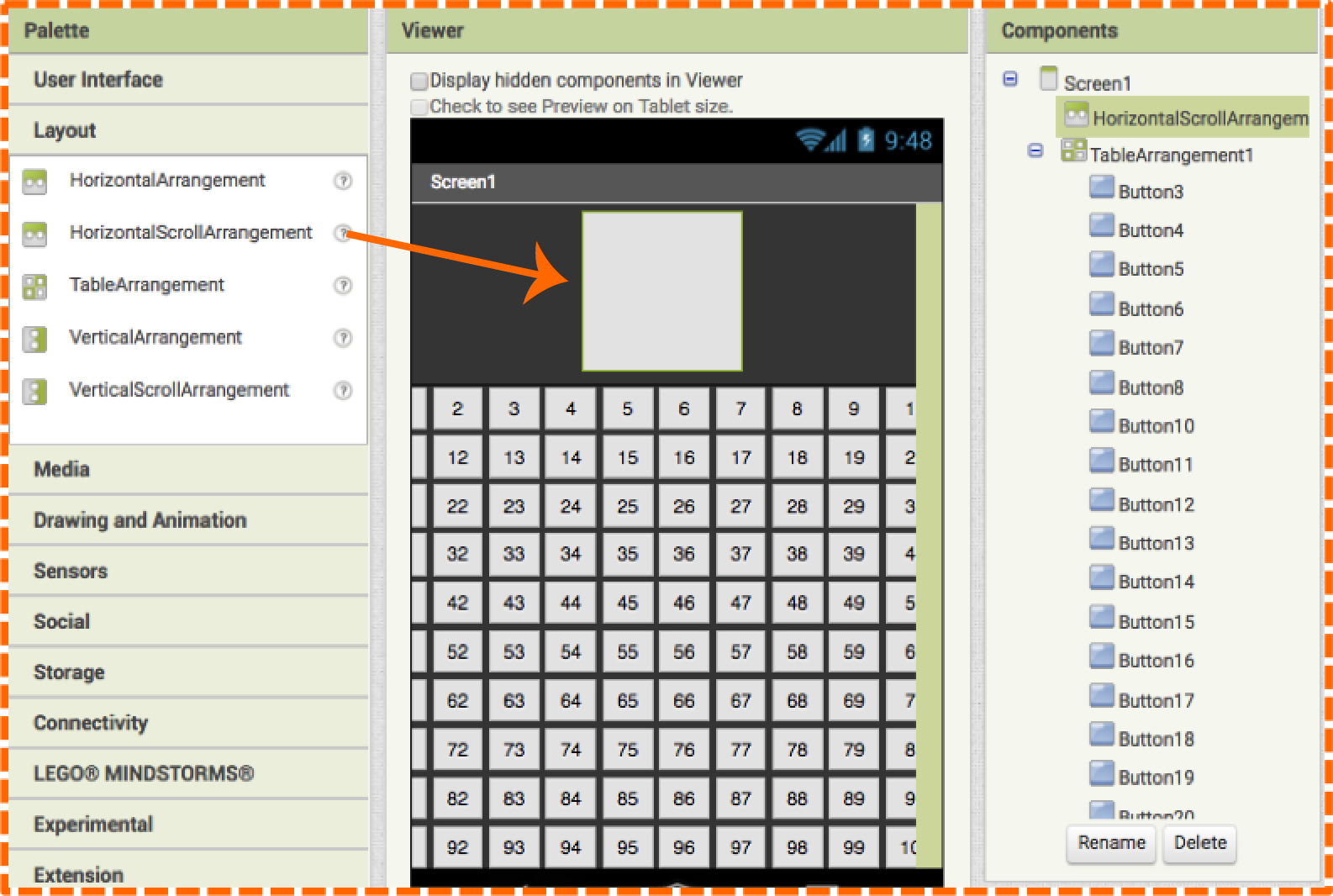
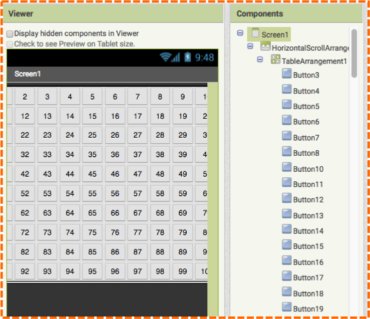
When creating certain layouts, such as our 100 Buttons design, sometimes the entire UI won’t appear on screen. You can clearly see that one column on the right is partially cut off and the last column is completely hidden. Thus, there is no way for the app user to access those buttons as the app currently is designed. But there is a new App Inventor Component that provides a solution: HorizontalScrollArrangement. This Component is found in the same Palette drawer as the other Layouts, as shown in image #13.
To solve the problem of UI being cut off on screen, we can add a HorizontalScrollArrangement to the Viewer in the Designer and then nestle the TableArrangement (which contains all of the Buttons) into it, as shown in the following image in the Designer. (Note in the Components panel how TableArrangement is indented to the right of HorizontalScrollArrangement rather than being in line with it. This indicates that the TableArrangement is nestled inside of the HorizontalScrollArrangement.)

This process of getting the TableArrangement into HorizontalScrollArrangement may be a little tricky given all of the buttons, so we will give you a step-by-step process to achieve the layout shown in image #14.
Drag the HorizontalScrollArrangement from the Layout Palette onto the Viewer so that it lands above the TableArrangement as shown in the following image. (Note in the Components panel how HorizontalScrollArrangement and TableArrangement are in line with each other indicating that they positioned separately in the Viewer.)
To make it easier to grab the TableArrangement and move it into the HorizontalScrollArrangement, we will temporarily remove a button from the TableArrangement by dragging it elsewhere onto the Viewer. We grabbed Button1, (but you could remove another button) and placed it onto the dark grey background the Viewer. It landed between the TableArrangement and the HorizontalScrollArrangement as shown in image #16.
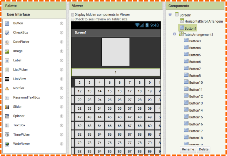
As the image #16 shows, there is an empty space in the TableArrangement where Button1 used to sit. Place your cursor in the empty space to easily grab the TableArrangment and drag it up into the HorizontalScrollArrangement. Your screen should resemble image #17.
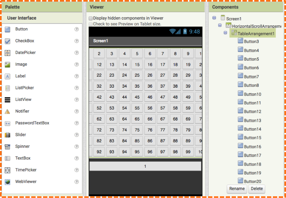
Lastly, we will put Button1 back where it belongs. Click on Button1 and drag it back into its previous position inside the TableArrangement (which now sits inside of the HorizontalScrollArrangement.). Your screen should resemble image #18.
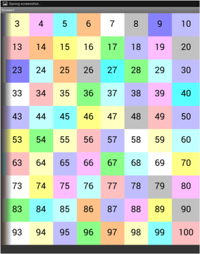
The view on your mobile screen display will have a noticeable difference with the HorizontalScrollArrangment Component added- a dark shadow along the right hand (or left hand) column. This shadow indicates that there is more UI to the right or left side that can be viewed by scrolling horizontally. Image #19 with the dark shadow on the right indicates that there is more information to the right of the screen and the Component will allow the user to scroll to the right. Whereas, the image #20 with the dark shadow on the left indicates there is more information to the left and the Component allows users to scroll to the left.
This scrolling feature allows for design overflow and enables app inventors to expand their UI features. The HorizontalScrollArrangment (or the VerticalScrollArrangement) provides a much-needed solution for expanded UIs, when part of the display is hidden on the mobile device or when the Responsive Sizing property displays a UI that is too small to be functional.